Maintaining and modernizing productivity
The goal of the General Electric’s Workplace Portal is to allow access to remote work essential in a time where there was unknown changes and high expectations to react.
GE quickly needed to be efficient with providing employees everything they need to transition to remote work.
As a Sr. UX Interaction Designer…
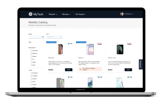
I optimized and introduced new processes so that 300,000 employees can request provisions for work, including, computers, accessories, mobile services, and software. I designed the UI, following GE”s brand but modernizing it to follow universal patterns.
I was responsible for designing, prototyping and testing concepts and collaborate with the product and engineering team for its development and adoption.
“I want to know that everything I need to do my job is available to me.”
Success Metric:
Increase successful requests and approval workflows for 300.000 employees
Manager and employee satisfaction
Decrease support tickets related to computer, and cellphone requests
Mission:
Create a solution to speed up the request and approval process for laptops, cellphones and other provisional requests
Design the manager experience on GE’s digital workplace portal
Design and test visuals for desktop and mobile
Attaining essentials for work should not be so difficult
Areas of confusion:
Pop-up modals was disruptive and unpleasant
Employees did not understand how to request items because were not sure what their teams’ required
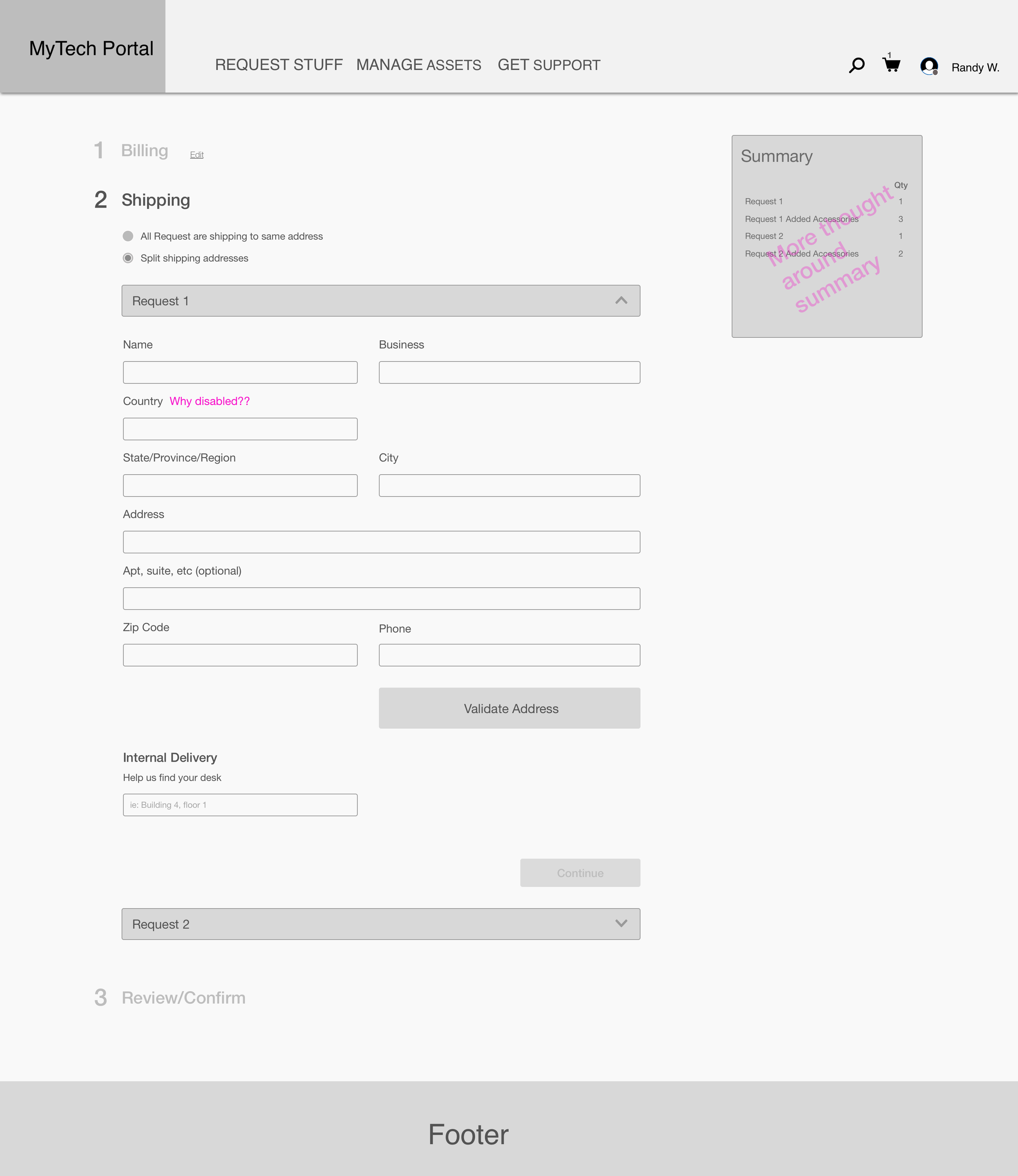
Request flow included unexpected conditional questions throughout 7 steps and caused analysis paralysis
There was technical configuration for specs and questions that was important to the business not the employee.
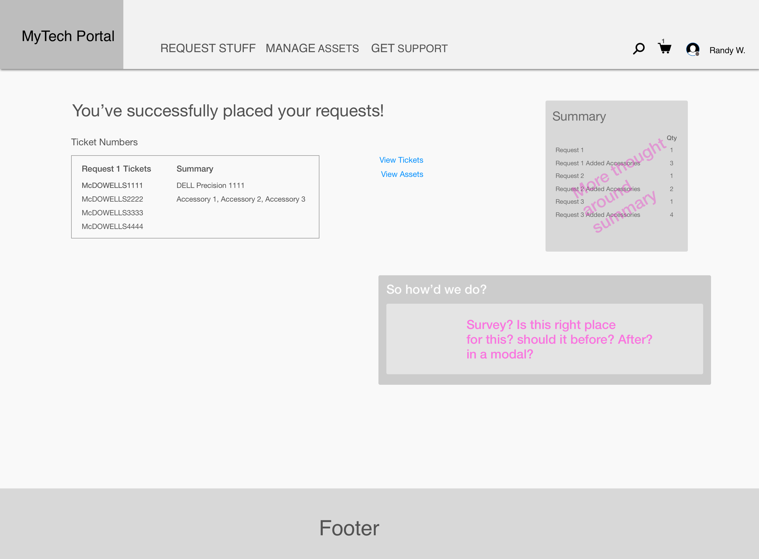
Confirmation of requests was blended with satisfaction survey with no indications of when the device was going to be shipped
E-commerce patterns are universally understood and enabled confidence in making right choices
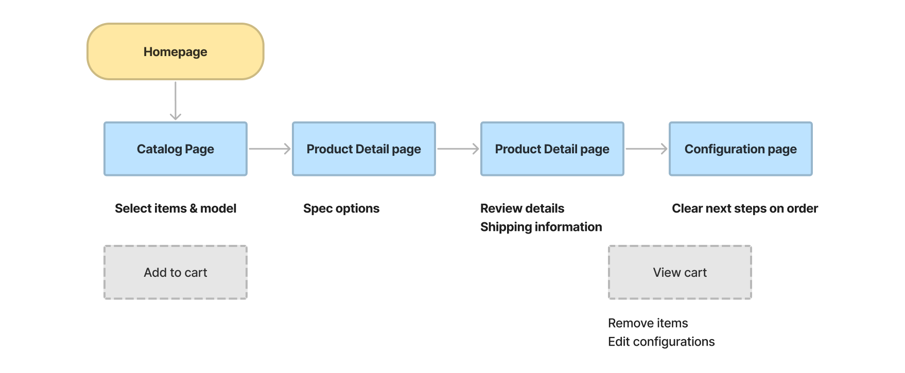
Revamping the information architecture
Through some analysis of the navigational structure, I uncovered many duplications of pages and multiple ways to access very important areas of the website. With some IA testing, I was able to identify the most intuitive content structure that represented the goal of the web app.
Initial wireframes


Bringing the right concepts to life
Success Metric:
Saved 60% in inventory budget
Manager visibility to teams requests
Reduced support tickets for one-off requests
All employees requested accurate devices for their needs and responsibilities
Launched with backed-up confidence
Usability testing to shed light at the highest expected paths.
Before investing time in engineering a solution, I wanted to make sure I was designing the right thing. I used Maze, a testing tool that informed my design decisions more confidently.


