Mirror is a responsive e-commerce retail store for women and men.
Challenge
Mirror is an international brick-and-mortar clothing store looking to add online sales to their buisness by building an e-commerce website. I was responsible for designing their logo and branding to attract both male and female customers. as well as to design the UX and UI of the responsive e-commerce website.
Design Process
RESEARCH
Percentage of total US e-commerce traffic
REASEARCH
Secondary research/ Competitive analysis: I wanted to understand the retail e-commerce market and to learn about common practices on their responsive websites.
Primary research/ User interviews: I interviewed 10 online shoppers to gain insight on their shopping feelings and reasons for choosing an e-commerce store over a physical store. I also wanted to learn about their likes and dislikes of their current online shopping experiences.
Interview findings
- Customers look for social validation for their purchasing decisions.
- Customers use physical stores and online stores as a supplement of one and other.
- Most purchases are performed on desktop or laptop.
- Customers need a shopping experience that is seamless and reliable.
- Store needs to be approachable to the customers to build trust and loyalty.
PERSONA DEVELOPMENT & EMPATHY MAP
Based on the research findings, I developed a persona to have a realistic representation of Mirror's key audience. Our persona, Carol Morales, a 29 year-old female from Chicago helps address the major needs and aspirations of the user group.


DEFINE
SITEMAP
After understanding the target audience, I conducted a card sorting exercise to understand how users categorize the products Mirror sells. The content categories and subcategories helped me start the interaction design using taxonomy of an e-commerce retailer and establish content hierarchy.
HOMEPAGE SKETCHES
IDEATE
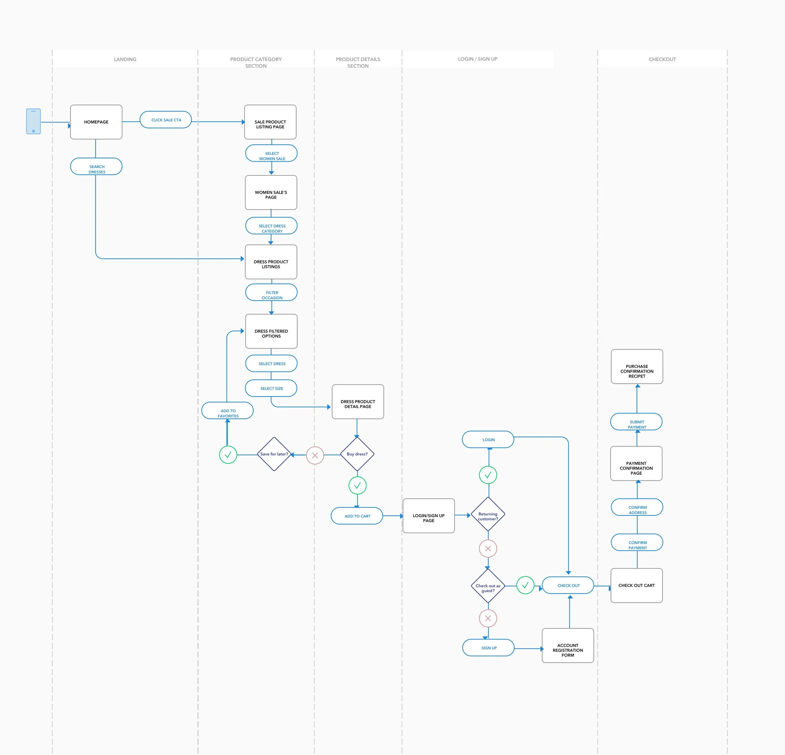
TASK FLOW & USER FLOW
By identifying the main flow that Mirror's users will follow to complete a main task of purchasing an item,
To further empathize with the user, the main steps on the user flow identifies the different paths that a user would take to complete each task, considering points of entry, browsing for items, and sign ups in the process.


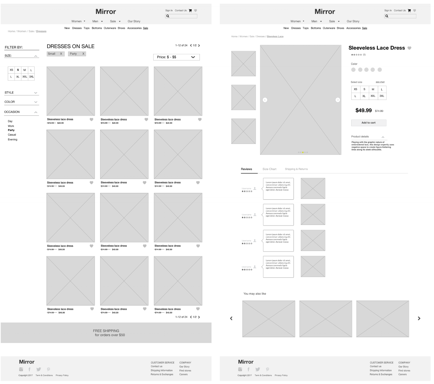
WIREFRAMES
PROTOTYPE
LOGO & BRANDING
Finally, I was ready to work on the visual design starting with the logo. Like all my designs I start with paper and pencil. I sketched anything that came to mind when thinking of the literal word "mirror". Here were a few of my sketches...
I experimented with the concept of broken mirror fragments symbolizing breaking away from the distorted interpretation that we give ourselves.
The final logo and branding of Mirror represents authenticity and individuality; a confidence in identity.
UI KIT & RESPONSIVE UI
TEST
I created a high-fidelity desktop prototype Invision and conducted a usability tests on 10 users. After a few iterations and recommendations we established error-free completion for on tasks for searching and purchasing a dress on sale. The next steps are to design and test additional screens before implementation.


